

So while researching and possibly dissecting the architecture of websites, our team compiled a list of broadcast design sites we felt were compelling or perhaps had some device/design that intrigued and captivated us, so we'd stay a bit longer (a very important must-have, I've discovered through the use of Google Analytics, in order to drive traffic to one's site).
The one site that truly embodied all the qualities of what we were ultimately looking to develop on our own website, had not only the ability to showcase their great work for reknowned brand names like Showtime and Target, but also exquisitely establish a connection with users ergo 'spark'-ing an interest and inviting us to stay a little longer.

Founded and created by the legendary Elaine Cantwell in 2002, SPARK's minimalist yet alluring site design, ignited in us a reason to poke around a bit more, only to ulitmately uncover the design group's vibrant and innovative body of work that is truly "visually unique and strategically accurate". Teaming up with Executive Producer extraordinaire, Patty Kiley, the two lovely ladies have created an online experience that's sexy and smart for SPARK.
Recently, THE DIRTYBLOG spoke to the SPARK ladies about their site. Here's what Creative Director Elaine Cantwell had to say about the goals, the inspiration and the process of creating this sublime experience:
DB: What can you tell us about the objectives/goals for creating the SPARK website?
EC: The goal was to primarily to showcase the work while also conveying the personality of the spark brand in a simple and clean manner. Function became the inspiration to the form to create a simple place in which to house the work.

DB: What is the inspiration for the architecture and design of the site'?
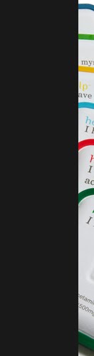
EC: The colour bar concept takes its inspiration from the creative process. It illustrates, albeit in abstract form, the journey from the moment of inspiration to manifestation. The white colour chip represents the ignition of a spark, the white-hot phase of a flame as the ah-a moment where the idea forms. The spark then travels through the green and blue hues until it burns as a red flame giving energy to the idea. The flame then dissipates allowing the idea take life and exist on it’s own. Each page of the website features the colour journey in different forms. The work is where the passion exists and is featured at the red point in the journey.
DB: What about your process? How did you develop this sensory experience that brands you and distinguishes SPARK?
EC: The process was an evolutionary one of finding the balance between function and form. Each page first and foremost needed to communicate the content in a simple manner. The environment of the site was looked at as a gallery space where the work is the feature and the environment is supportive to the work. The visual and audio cues were created to guide the user through the site and also to communicate the whimsical spark personality.
Thank you Elaine Cantwell and Patty Kiley.
Please visit the site for this sensorial and sublime experience that is SPARK!
http://www.sparkcreativeinc.com/


0 comments:
Post a Comment
Please comment. Thank you.